Preview CAL iWasLike Pro Quasi Light Falling font with your text


CAL iWasLike Pro Quasi Light Falling font
Publisher
MyFonts.com
License
$ Commercial
Date added
Jul 30 2023
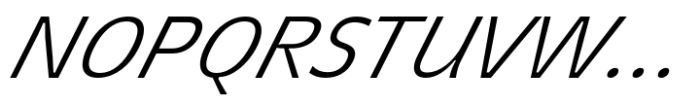
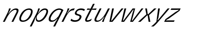
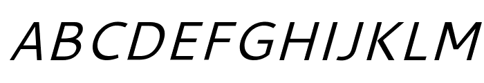
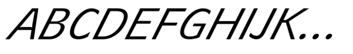
A modern, italicized sans-serif font with a clean and streamlined appearance.
This is a sleek, italicized sans-serif font with a modern and clean appearance. The characters are slightly condensed, offering a streamlined look. The strokes are consistent in thickness, providing a uniform and professional feel.
Ideal for modern branding, digital interfaces, and sleek editorial designs.
Headlines, Body text, Logos
Balanced
Download CAL iWasLike Pro Quasi Light Falling font.
Ideal for modern branding, digital interfaces, and sleek editorial designs.
Headlines, Body text, Logos
Balanced
WhatFontIs.com
whatfontis.com
Discover · Preview · Download
Find any Font
AI-powered · 1,200,000+ fonts
Find any Font
from any image
commercial or free
AI-powered · 1,200,000+ fonts
Commercial
MyFonts.com
Now featuring
CAL iWasLike Pro Quasi Light Falling
Uppercase Characters
Lowercase Characters
Numbers & Special Characters
Ideal for
Best use for
Best use for
this font
Headlines, Branding, Logos
Print, Digital, Advertising
whatfontis.com
Identify any font from an image
Upload · Identify
Visit WhatFontIs.com — the #1 Font Finder
Upload · Identify
Download Free
Visit WhatFontIs.com — the #1 Font Finder
Category
Bold
No
Italic
Yes
Weight
Light
Width
Condensed
Character spacing
Normal
Line height
Normal
Contrast
Low
Overall style
Modern
X height
Medium
Cap height
High

$ Free > Personal Use
$ Free > Personal Use
Similar fonts for CAL iWasLike Pro Quasi Light Falling from Adobe.com
$ Commercial > Adobe.com

$ Commercial > Adobe.com
Similar fonts for CAL iWasLike Pro Quasi Light Falling from MyFonts.com
$ Commercial > MyFonts.com
$ Commercial > MyFonts.com
Similar fonts for CAL iWasLike Pro Quasi Light Falling from CreativeMarket.com

$ Commercial > CreativeMarket.com

$ Commercial > CreativeMarket.com

Help your fellow font-seekers if you think you can recognize the font. Earn some good karma by doing it :-) Answer & Help
Yet sometimes the images are very complex, so other users need a bit of help.
If you recognize the font from the samples posted here don't be shy and help a fellow designer.
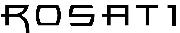
Thousands of designers (famous or not) use the image font detection system to find a font or similar free fonts from an image. Although we have the largest database of fonts, the search for a font from an image gets mixed results like the image above.
Recognize the font? Browse forumHave a font you want to use on the web?
Webfont Generatorin seconds.