Preview Atlantic Cruise Pro Heavy font with your text


Atlantic Cruise Pro Heavy font
Publisher
MyFonts.com
License
$ Commercial
Date added
Dec 08 2025
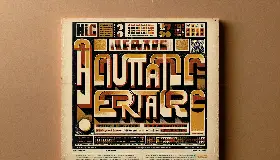
Heavy, condensed sans-serif font with geometric and stylized elements.
A heavy weight sans-serif font with a condensed width, featuring tall, narrow characters with slight geometric influences and minimal stroke contrast. The uppercase and lowercase letters maintain consistent stroke thickness, with some unique stylized elements such as the pointed apex on 'A' and the curved tail on 'Q'. Numerals and symbols follow the same design principles, maintaining clarity and boldness.
Suitable for headlines, posters, branding, logos, and display text where strong visual impact is needed.
Headlines, Logos, Posters
Download Atlantic Cruise Pro Heavy font.
Suitable for headlines, posters, branding, logos, and display text where strong visual impact is needed.
Headlines, Logos, Posters
WhatFontIs.com
whatfontis.com
Discover · Preview · Download
Find any Font
AI-powered · 1,200,000+ fonts
Find any Font
from any image
commercial or free
AI-powered · 1,200,000+ fonts
Commercial
MyFonts.com
Now featuring
Atlantic Cruise Pro Heavy
Uppercase Characters
Lowercase Characters
Numbers & Special Characters
Ideal for
Best use for
Best use for
this font
Headlines, Branding, Logos
Print, Digital, Advertising
whatfontis.com
Identify any font from an image
Upload · Identify
Visit WhatFontIs.com — the #1 Font Finder
Upload · Identify
Download Free
Visit WhatFontIs.com — the #1 Font Finder
Category
Bold
Yes
Italic
No
Weight
Bold
Width
Condensed
Character spacing
Normal
Line height
Normal
Contrast
Low
Overall style
Modern with geometric influences
X height
Cap height
Help your fellow font-seekers if you think you can recognize the font. Earn some good karma by doing it :-) Answer & Help
Yet sometimes the images are very complex, so other users need a bit of help.
If you recognize the font from the samples posted here don't be shy and help a fellow designer.
Thousands of designers (famous or not) use the image font detection system to find a font or similar free fonts from an image. Although we have the largest database of fonts, the search for a font from an image gets mixed results like the image above.
Recognize the font? Browse forumHave a font you want to use on the web?
Webfont Generatorin seconds.