If you’ve noticed that the typography on your favorite brands has started to look slightly off lately, you’re not imagining it. Letters are sitting at strange angles. Serifs are showing up where they shouldn’t. Curves are bulging in places that feel almost wrong. There’s a name for what’s happening, and it might be the most interesting type movement of the year.
Designers are calling it Mutant Heritage. And after a decade of clean, sterile, sans-serif minimalism, it feels like a release valve.
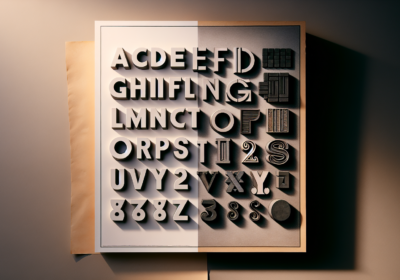
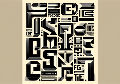
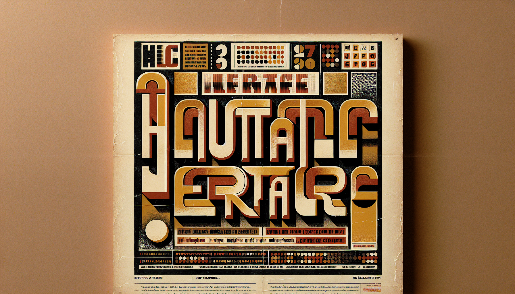
What Mutant Heritage Actually IsThe simplest way to describe it: take a typeface from the past, then break it on purpose. Old slab serifs from 1920s newspaper ads. Mid-century grotesks like the ones you’d find on a 1960s record sleeve. Phototype-era display faces from the 70s. The reference material is anything pre-digital, anything that has the messiness of a real printing process baked into its bones.
Then designers hack it. They distort proportions on purpose. They add curves where the original was straight. They mismatch weights across a single word. They let the spacing breathe weirdly, or compress it until letters touch. The result is a typeface that looks like a familiar antique with the dial cranked just past comfortable.
You see this everywhere now. Refreshed brand identities for indie magazines, food packaging that wants to feel artisanal, fashion campaigns trying to hint at archive material without actually being archival. The mutant heritage approach lets a brand borrow the warmth of the past while signaling that something contemporary is happening too.
Why This, Why NowThere are three pressures pushing designers in this direction, and they all stack on top of each other.
First, the minimalist sans-serif era ran out of road. From 2015 to 2024, every tech company, DTC brand, and startup adopted the same neutral geometric sans. Helvetica, Inter, Söhne, and their cousins. The whole point was to get out of the way. The unintended consequence was that brands stopped looking different from each other. A frictionless type system became a forgettable one.
Second, AI made perfection cheap. Anyone can generate a polished sans-serif lockup in fifteen seconds now. When the algorithmically clean look becomes the default output of a free tool, it stops being a flex. Mutant heritage is partly a reaction: it’s typography that visibly wasn’t generated, that bears the marks of human decisions, including the wrong ones.
Third, audiences are hungry for warmth. Every cultural metric shows people exhausted by digital surfaces, craving things that feel handmade, lived-in, slightly imperfect. Mutant heritage delivers that warmth without crossing into actual handcraft, which is harder and more expensive to commission. It’s perfection’s awkward cousin, and right now the awkward cousin has all the friends.
The Foundries Driving ItThis isn’t a single foundry’s idea. It’s a movement spread across dozens of small, independent type studios who’ve been quietly pushing this aesthetic for a few years. ABC Dinamo in Switzerland has been releasing reworked classics with intentional irregularities. Pangram Pangram has fonts that look like they were photocopied a few too many times. Production Type, Display, Sharp Type, and a dozen smaller foundries are putting out variations on the theme.
The interesting thing is that most of these typefaces are technically clean. They’re not actually scratched or distorted. The mutation is in the design itself: the proportions, the weight contrasts, the unexpected curves. That makes them perfectly usable as production type. You get the visual texture of imperfection with the technical reliability of a properly drawn font. It’s the best of both worlds, and it’s exactly why brand systems are eating it up.
Where to Spot It in the WildPay attention to indie magazine cover typography over the next few months. That’s where this trend is most visible. Editorial designers were the first to leave behind the clean sans look, partly because magazines have always thrived on personality and partly because print readers are forgiving of weirdness in a way app users aren’t.
You’ll also see it in restaurant branding. Walk through any city’s recently opened spots and notice how many have wordmarks that read like they were lifted from a 1960s sign painter who’d had a strange afternoon. The food and drink category leans naturally toward warmth and craft, which makes mutant heritage a perfect fit.
Streaming services are starting to dip in too. Look at the title cards on prestige TV. Dark academia shows in particular are using typefaces that read like Gothic revivals filtered through a slightly unstable digital tool. It’s a far cry from the chunky sans of the early streaming wars.
How to Use It Without Looking Like You’re TryingMutant heritage is easy to overdo. The trap is treating quirkiness as the entire personality of a brand. A wordmark with three different curves and a lopsided crossbar might feel fresh once, but spread that energy across an entire identity system and the result is a mess.
The brands doing this well are pairing one expressive display typeface with a quiet, well-mannered text face. The mutant face does the heavy lifting on covers, posters, and hero moments. The supporting face keeps the body copy readable and the system functional. That’s the pattern: heritage with mutations on top, neutral structure underneath.
Avoid the temptation to make your own mutant typeface from scratch unless you have a real type designer on the team. Modifying letterforms looks easy and is in fact terribly hard. The gap between intentionally weird and accidentally amateur is much smaller than people realize.
What This Means for Brand Work in 2026If you’re working on a rebrand this year, the safe sans-serif default is no longer safe. Choosing it means looking like every other brand that picked it five years ago. The interesting question isn’t whether to use a personality-driven typeface, but which kind of personality fits the brand.
Mutant heritage is a strong answer for brands that want to feel established but not stiff, premium but not precious, distinctive but not weird for its own sake. It’s especially powerful for categories where craft matters: food, fashion, hospitality, publishing, anything trying to escape the tech-startup aesthetic.
The flip side: if your brand needs to feel ultra-modern, sterile, or scientific, mutant heritage will fight you. Match the type to the story you’re telling, not to whatever’s trending hardest this quarter.
Are you seeing this trend show up in projects you’re working on? And do you think we’re heading for a long stretch of expressive, slightly weird typography, or is this just a brief breath before everyone snaps back to clean sans-serifs?

I'm a programmer at heart. But in my 20s, I realized there was more to the world of fonts than just Courier.
Driven by endless curiosity, I built a system to explore them.
That project grew into one of the world’s leading font identifier platforms: www.WhatFontIs.com.
By 2024, WhatFontIs is helping nearly one million designers—famous or not—discover the names of the fonts they need.