Preview BioRhyme Expanded 300 font with your text


BioRhyme Expanded 300 font
Publisher
License
$ Free for commercial use
Date added
Nov 08 2019
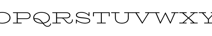
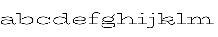
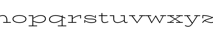
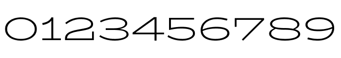
A modern serif font with expanded, geometric letterforms.
This font features a clean and modern serif style with expanded letterforms. It has a balanced structure with thin strokes and a geometric appearance, making it highly legible.
Ideal for editorial design, branding, and headlines where a modern yet classic look is desired.
Headlines, Branding, Editorial design
Balanced
Download BioRhyme Expanded 300 font. BioRhyme Expanded 300 by Google Fonts. All fonts are released under open source licenses. You can use them in any non-commercial or commercial project. Copyright 2016 Aoife Mooney (aoifemooney@gmail.com www.aoifemooney.org)
Ideal for editorial design, branding, and headlines where a modern yet classic look is desired.
Headlines, Branding, Editorial design
Balanced
WhatFontIs.com
whatfontis.com
Discover · Preview · Download
Find any Font
AI-powered · 1,200,000+ fonts
Find any Font
from any image
commercial or free
AI-powered · 1,200,000+ fonts
Commercial
Now featuring
BioRhyme Expanded 300
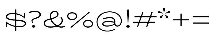
Uppercase Characters
Lowercase Characters
Numbers & Special Characters
Ideal for
Best use for
Best use for
this font
Headlines, Branding, Logos
Print, Digital, Advertising
Available on
⬇ Download Font
whatfontis.com
Identify any font from an image
Upload · Identify
Visit WhatFontIs.com — the #1 Font Finder
Upload · Identify
Download Free
Visit WhatFontIs.com — the #1 Font Finder
Category
Bold
No
Italic
No
Weight
Light
Width
Expanded
Character spacing
Normal
Line height
Normal
Contrast
Low
Overall style
Modern
X height
Medium
Cap height
High
Help your fellow font-seekers if you think you can recognize the font. Earn some good karma by doing it :-) Answer & Help
Yet sometimes the images are very complex, so other users need a bit of help.
If you recognize the font from the samples posted here don't be shy and help a fellow designer.
Thousands of designers (famous or not) use the image font detection system to find a font or similar free fonts from an image. Although we have the largest database of fonts, the search for a font from an image gets mixed results like the image above.
Recognize the font? Browse forumHave a font you want to use on the web?
Webfont Generatorin seconds.