Preview More is less 22 Displacement font with your text


More is less 22 Displacement font
Publisher
License
$ Free for personal use
Date added
Feb 17 2023
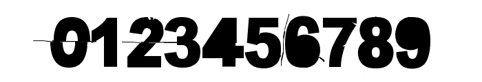
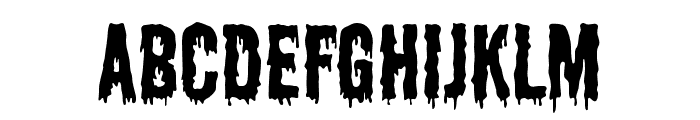
Bold, distressed font with a grunge effect.
This font features bold, uppercase letters with a distressed, grunge effect. The characters appear to be sliced or displaced, creating a dynamic and edgy look. The style is bold and impactful, suitable for attention-grabbing designs.
Ideal for posters, album covers, and urban-themed designs.
Headlines, Logos
Balanced
Download More is less 22 Displacement font. More is less 22 Displacement by
Ideal for posters, album covers, and urban-themed designs.
Headlines, Logos
Balanced
(Fonts by junkohanhero - Personal-use only. For commercial use please contact owner.)
WhatFontIs.com
whatfontis.com
Discover · Preview · Download
Find any Font
AI-powered · 1,200,000+ fonts
Find any Font
from any image
commercial or free
AI-powered · 1,200,000+ fonts
Free
Now featuring
More is less 22 Displacement
Uppercase Characters
Lowercase Characters
Numbers & Special Characters
Ideal for
Best use for
Best use for
this font
Headlines, Branding, Logos
Print, Digital, Advertising
Available on
⬇ Download Font
whatfontis.com
Identify any font from an image
Upload · Identify
Visit WhatFontIs.com — the #1 Font Finder
Upload · Identify
Download Free
Visit WhatFontIs.com — the #1 Font Finder
Category
Bold
Yes
Italic
No
Weight
Bold
Width
Normal
Character spacing
Normal
Line height
Normal
Contrast
Low
Overall style
Modern, Grunge
X height
Medium
Cap height
High
Similar Free Fonts for More is less 22 Displacement
$ Free > Personal Use

$ Free > Personal Use
Similar fonts for More is less 22 Displacement from Adobe.com

$ Commercial > Adobe.com
$ Commercial > Adobe.com
Similar fonts for More is less 22 Displacement from MyFonts.com

$ Commercial > MyFonts.com

$ Commercial > MyFonts.com
Similar fonts for More is less 22 Displacement from CreativeMarket.com

$ Commercial > CreativeMarket.com

$ Commercial > CreativeMarket.com
Help your fellow font-seekers if you think you can recognize the font. Earn some good karma by doing it :-) Answer & Help

Yet sometimes the images are very complex, so other users need a bit of help.
If you recognize the font from the samples posted here don't be shy and help a fellow designer.
Thousands of designers (famous or not) use the image font detection system to find a font or similar free fonts from an image. Although we have the largest database of fonts, the search for a font from an image gets mixed results like the image above.
Recognize the font? Browse forumHave a font you want to use on the web?
Webfont Generatorin seconds.