Preview How Bout That font with your text

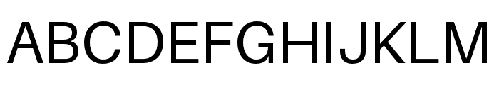
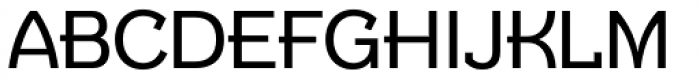
How Bout That font
Publisher
License
$ Free for personal use
Date added
Jan 12 2017
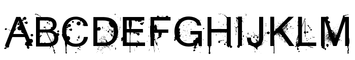
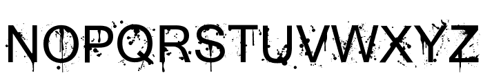
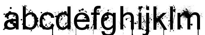
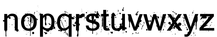
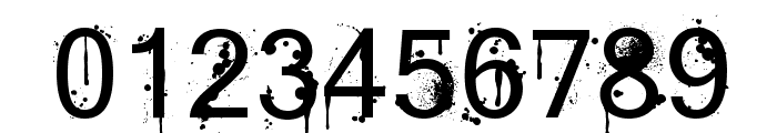
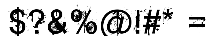
A grunge-style font with splatter effects and bold characters.
This font features a distressed, grunge style with splatter effects, giving it an edgy and urban appearance. The characters are bold and uppercase letters are slightly taller than lowercase, with irregular edges that add to the chaotic aesthetic.
Ideal for music album covers, street art designs, edgy posters, and urban-themed branding.
Logos, Posters, Album Covers
Balanced
Download How Bout That font. How Bout That by © 2013 Jayde Garrow Fonts. All Rights Reserved
Ideal for music album covers, street art designs, edgy posters, and urban-themed branding.
Logos, Posters, Album Covers
Balanced
(Fonts by Jayde Garrow - GarrowGlitch - http://jaydegarrow.wix.com/jaydefonts. Personal-use only. For commercial use please contact owner.)
WhatFontIs.com
whatfontis.com
Discover · Preview · Download
Find any Font
AI-powered · 1,200,000+ fonts
Find any Font
from any image
commercial or free
AI-powered · 1,200,000+ fonts
Free
Now featuring
How Bout That
Uppercase Characters
Lowercase Characters
Numbers & Special Characters
Ideal for
Best use for
Best use for
this font
Headlines, Branding, Logos
Print, Digital, Advertising
Available on
⬇ Download Font
whatfontis.com
Identify any font from an image
Upload · Identify
Visit WhatFontIs.com — the #1 Font Finder
Upload · Identify
Download Free
Visit WhatFontIs.com — the #1 Font Finder
Category
Bold
Yes
Italic
No
Weight
Bold
Width
Normal
Character spacing
Normal
Line height
Normal
Contrast
Low
Overall style
Grunge, Urban
X height
Medium
Cap height
High
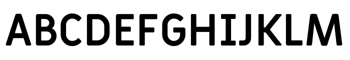
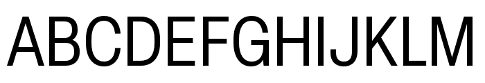
Similar Free Fonts for How Bout That
$ Free > Personal Use
$ Free > Personal Use
Similar fonts for How Bout That from Adobe.com
$ Commercial > Adobe.com
$ Commercial > Adobe.com
Similar fonts for How Bout That from MyFonts.com
$ Commercial > MyFonts.com

$ Commercial > MyFonts.com
Similar fonts for How Bout That from CreativeMarket.com

$ Commercial > CreativeMarket.com

$ Commercial > CreativeMarket.com
Help your fellow font-seekers if you think you can recognize the font. Earn some good karma by doing it :-) Answer & Help

Yet sometimes the images are very complex, so other users need a bit of help.
If you recognize the font from the samples posted here don't be shy and help a fellow designer.
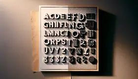
Thousands of designers (famous or not) use the image font detection system to find a font or similar free fonts from an image. Although we have the largest database of fonts, the search for a font from an image gets mixed results like the image above.
Recognize the font? Browse forumHave a font you want to use on the web?
Webfont Generatorin seconds.