Preview Versus otf (400) font with your text


Versus otf (400) font
Publisher
CreativeMarket.com
License
$ Commercial
Date added
Apr 25 2019
Bold, condensed sans-serif font with a modern look.
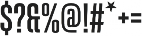
This font features bold, condensed characters with a modern, sans-serif style. The strokes are consistent in thickness, providing a uniform appearance. The uppercase and lowercase letters are distinct, with a tall x-height and prominent cap height. The numerals and special characters maintain the same bold and condensed style.
Ideal for headlines, posters, and branding materials that require a strong visual impact.
Headlines, Logos
Balanced
Download Versus otf (400) font. Versus otf (400) by Latinotype
Ideal for headlines, posters, and branding materials that require a strong visual impact.
Headlines, Logos
Balanced
WhatFontIs.com
whatfontis.com
Discover · Preview · Download
Find any Font
AI-powered · 1,200,000+ fonts
Find any Font
from any image
commercial or free
AI-powered · 1,200,000+ fonts
Commercial
CreativeMarket.com
Now featuring
Versus otf (400)
Uppercase Characters
Lowercase Characters
Numbers & Special Characters
Ideal for
Best use for
Best use for
this font
Headlines, Branding, Logos
Print, Digital, Advertising
whatfontis.com
Identify any font from an image
Upload · Identify
Visit WhatFontIs.com — the #1 Font Finder
Upload · Identify
Download Free
Visit WhatFontIs.com — the #1 Font Finder
Category
Bold
Yes
Italic
No
Weight
Bold
Width
Condensed
Character spacing
Tight
Line height
Normal
Contrast
Low
Overall style
Modern
X height
High
Cap height
Other

$ Free > Personal Use

$ Free > Personal Use
Similar fonts for Versus otf (400) from Adobe.com

$ Commercial > Adobe.com

$ Commercial > Adobe.com
Similar fonts for Versus otf (400) from MyFonts.com

$ Commercial > MyFonts.com

$ Commercial > MyFonts.com
Similar fonts for Versus otf (400) from CreativeMarket.com
$ Commercial > CreativeMarket.com

$ Commercial > CreativeMarket.com
Help your fellow font-seekers if you think you can recognize the font. Earn some good karma by doing it :-) Answer & Help

Yet sometimes the images are very complex, so other users need a bit of help.
If you recognize the font from the samples posted here don't be shy and help a fellow designer.
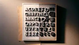
Thousands of designers (famous or not) use the image font detection system to find a font or similar free fonts from an image. Although we have the largest database of fonts, the search for a font from an image gets mixed results like the image above.
Recognize the font? Browse forumHave a font you want to use on the web?
Webfont Generatorin seconds.