Preview Eixample Dip Narrow Regular font with your text

Eixample Dip Narrow Regular font
Publisher
Adobe
License
$ Commercial
Date added
Mar 12 2023
A modern, narrow font with a clean and stylish design.
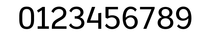
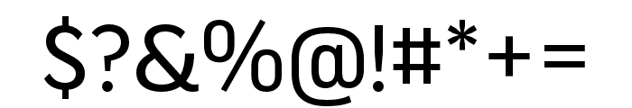
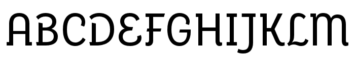
This font features a modern and clean design with a narrow structure. The characters have a slight curvature, providing a unique and stylish appearance. The strokes are consistent in weight, offering a balanced and readable look.
Ideal for branding, editorial design, and digital interfaces where a modern and sleek look is desired.
Headlines, Body text, Logos
Balanced
Download Eixample Dip Narrow Regular font. Eixample Dip Narrow Regular by ? 2022 Type-O-Tones. Sabina Chipara & Jose M. Uros. All rights reserved.
Ideal for branding, editorial design, and digital interfaces where a modern and sleek look is desired.
Headlines, Body text, Logos
Balanced
WhatFontIs.com
whatfontis.com
Discover · Preview · Download
Find any Font
AI-powered · 1,200,000+ fonts
Find any Font
from any image
commercial or free
AI-powered · 1,200,000+ fonts
Commercial
Adobe
Now featuring
Eixample Dip Narrow Regular
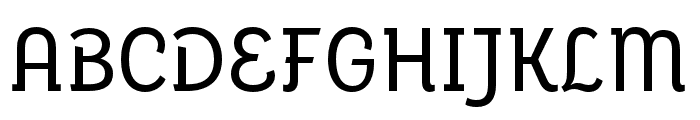
Uppercase Characters
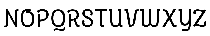
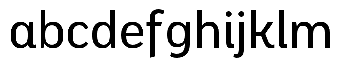
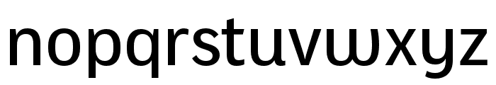
Lowercase Characters
Numbers & Special Characters
Ideal for
Best use for
Best use for
this font
Headlines, Branding, Logos
Print, Digital, Advertising
whatfontis.com
Identify any font from an image
Upload · Identify
Visit WhatFontIs.com — the #1 Font Finder
Upload · Identify
Download Free
Visit WhatFontIs.com — the #1 Font Finder
Category
Bold
No
Italic
No
Weight
Regular
Width
Condensed
Character spacing
Normal
Line height
Normal
Contrast
Low
Overall style
Modern
X height
Medium
Cap height
High

$ Free > Personal Use

$ Free > Personal Use
Similar fonts for Eixample Dip Narrow Regular from Adobe.com
$ Commercial > Adobe.com
$ Commercial > Adobe.com
Similar fonts for Eixample Dip Narrow Regular from MyFonts.com

$ Commercial > MyFonts.com

$ Commercial > MyFonts.com
Similar fonts for Eixample Dip Narrow Regular from CreativeMarket.com

$ Commercial > CreativeMarket.com

$ Commercial > CreativeMarket.com

Help your fellow font-seekers if you think you can recognize the font. Earn some good karma by doing it :-) Answer & Help

Yet sometimes the images are very complex, so other users need a bit of help.
If you recognize the font from the samples posted here don't be shy and help a fellow designer.
Thousands of designers (famous or not) use the image font detection system to find a font or similar free fonts from an image. Although we have the largest database of fonts, the search for a font from an image gets mixed results like the image above.
Recognize the font? Browse forumHave a font you want to use on the web?
Webfont Generatorin seconds.