How to crop your image for the best font match
The crop step is the single most important factor in getting an accurate result.
Spend 5 extra seconds here and our AI matches the right font in the next steps.
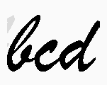
✓ Do this
- Select only the text — no decorations, frames, or images
- Keep 4 to 10 characters in the crop (a single word is ideal)
- Use the cleanest, sharpest sample on the image
- Crop should be roughly wider than tall (one line of text)
- If letters have shadows or outlines, include them — they're part of the font
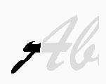
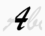
✗ Avoid this
- Don't include multiple fonts in one crop — pick one
- Don't crop just 1 or 2 letters — too little for the AI to match
- Don't include logos, icons, or photos — they confuse the splitter
- Don't crop angled or wavy text — straighten it first if you can
- Don't keep busy backgrounds — tighter crop = better result
Common questions about cropping
How many letters should I include?
Four to ten characters is the sweet spot. With fewer than 4 the AI doesn't have enough
shape information; with more than 10 the splitter can mis-segment touching letters and
hurt accuracy. A single word that's 5-8 characters long usually works perfectly.
Should I crop tight against the letters or leave some margin?
Leave a small margin — about half a letter-height of space on each side. Too tight
and you may clip the descenders (g, j, p, q, y) which the AI uses to disambiguate
fonts. Too loose and the background dominates the image. The crop tool shows a
live preview — adjust until the text fills most of the box.
My image has light text on a dark background. Will that work?
Yes. The next step (Optimize) lets you invert the colours so the AI always sees dark
letters on a light background. You don't need to invert anything yourself before the
crop — just select the text region as it is.
What if the letters are slightly tilted or in perspective?
Small tilts (under 5°) are fine. For larger angles, use the rotation slider on the
Optimize step before the AI matches. If the text wraps around a curve or is in 3D
perspective, the match is going to be approximate no matter what — try to find a
flatter sample of the same font instead.
The image has multiple fonts. Which one should I pick?
Pick one font per identification. WhatFontIs matches the dominant font in the crop;
mixing two fonts in the same selection will return results from a single
"average" guess that matches neither. If you need both fonts, do two separate
identifications — one crop per font.
My font is stylised (graffiti, hand-drawn, distorted). Any tips?
Heavily stylised lettering is the hardest case for any font ID tool. Try these:
pick the cleanest example you can find in the source image; crop tight to avoid
decorative strokes; on the Optimize step boost contrast to make the letter shapes
pop. If results are still off, check the "I feel lucky" mode (top of the
homepage) which skips the strict character split.
Can I re-crop if the first attempt didn't work?
Yes — the back button is enabled on every step. Re-crop, change which characters
you include, or try a different sample of the same font. We don't charge anything
until you sign up for PRO, so iterating is free.
My image is blurry. Should I sharpen it first?
Only mild sharpening helps; aggressive sharpening creates artifacts the splitter
picks up as fake serifs. The Optimize step has a built-in sharpen/contrast pair
that's tuned for font ID — use that instead of a separate editor.
Still stuck? Visit the Getting Started guide
for a walkthrough with screenshots, or post the image to our
community forum — there's usually someone willing to
help with hard cases.
 — skip them.
 — skip them.