Something unusual is happening in typeface design right now. The fonts arriving in March 2026 aren’t chasing the future — they’re looting the past with a purpose. Propaganda posters, 1970s feminist pamphlets, Victorian display printing, Arts and Crafts manuscripts: the most interesting new releases this month are all archaeological digs dressed up as type specimens. And the results are genuinely exciting.
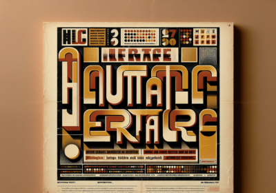
Neville Brody Goes Full AgitpropIf you only look at one typeface this month, make it BF Popaganda by Neville Brody. The legendary British designer — whose fingerprints are all over the visual culture of the 1980s through his work with The Face magazine — has reached back even further, to the visual language of revolutionary agitprop and constructivist print culture.
Available now through Type Network in 16 styles, BF Popaganda treats letterforms as instruments of confrontation. Characters are constructed, heavy, and deliberately blunt — like words torn from a protest banner or stamped onto a factory wall. Originally developed for editorial work at Arena Homme+, the typeface carries what Creative Boom’s reviewers describe as “propagandistic visual DNA,” which is a thrilling phrase to find in a font release announcement.
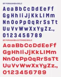
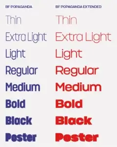
What makes Popaganda worth a closer look is Brody’s balance of brutality and craft. At headline sizes, it hits hard. At text sizes, it retains legibility without losing its edge. That tension — between the hammer blow and the careful hand — is what separates a genuinely good display typeface from one that only works as a poster gimmick.
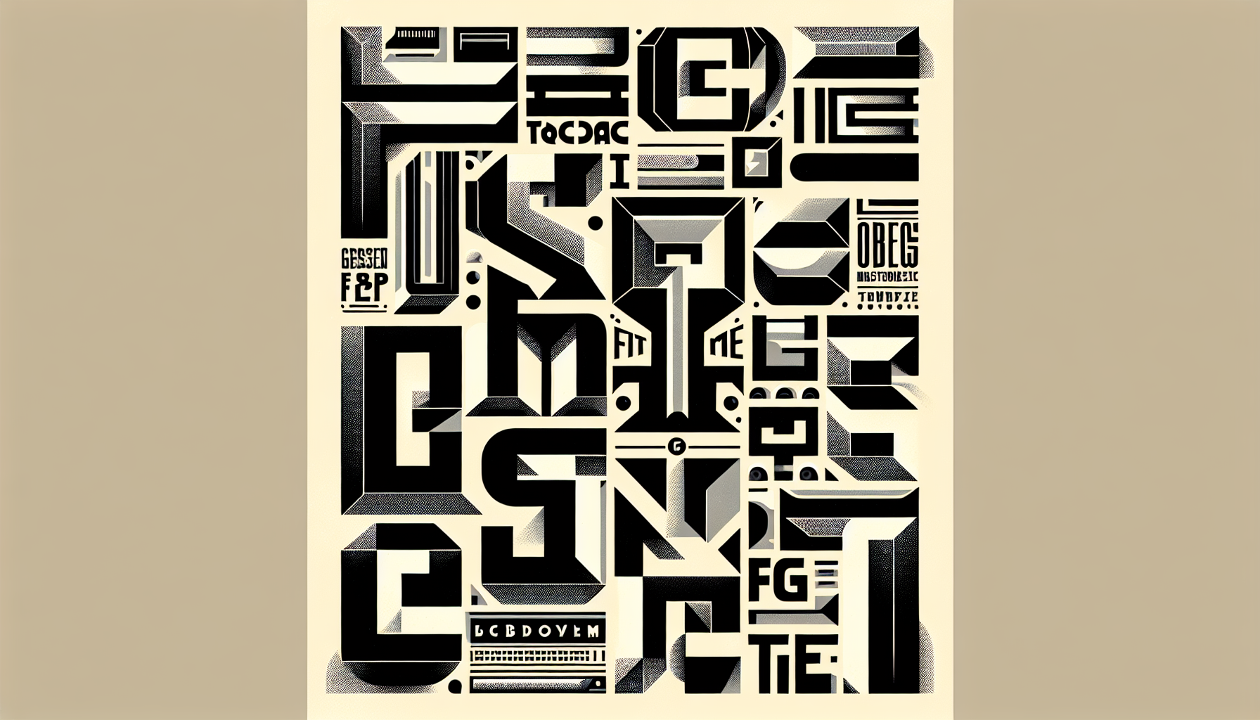
Please: A Variable Family That Gets Weird in the Best WayMark Caneso’s Please, released through his ps.type.lab foundry, takes a very different approach. Where Popaganda is confrontational, Please is curious — almost playful in how it probes the structural limits of type design.
The family spans three subfamilies (Please, Please Display, and Please Poster), each carrying a distinct typographic voice. The real interest lies at the extreme heavy end, where counters begin to fill in and the letterforms start to behave strangely. Caneso calls these weights “delightfully strange,” and that’s accurate. The lowercase ‘a’ at maximum heaviness hovers between legible and abstract, becoming something closer to a texture than a character.
This is variable font technology being used as an expressive tool rather than just a performance optimization. Most variable fonts give you weight, width, maybe optical size. Please gives you a journey from familiar to uncanny.
A 1972 Feminist Text Gets Its Own TypefacePerhaps the most culturally loaded release of the month comes from the collaborative studio ALT.tf and designer Eunice Su. ALT Erogenous is a display serif that revives the lettering from Combat in the Erogenous Zone, Ingrid Bengis’s 1972 feminist essay collection — a book that was radical in its time and hasn’t lost its charge.
The typeface captures the “internal tension and cultural questioning” of its source material through high-contrast strokes and sharp, almost aggressive terminals. It’s designed for single-word poster-scale applications, and in that context it’s electric. Each letterform feels like it’s holding something back, like there’s more force behind it than the page can contain.
Reviving historical lettering is nothing new in type design, but the choice of which historical lettering to revive is always a statement. Reaching back to Bengis’s 1972 feminist text right now doesn’t feel like coincidence — and that subtext makes ALT Erogenous far more interesting than a straightforward display serif revival.
The Heritage Revival Theme Running Through MarchPopaganda, ALT Erogenous, and Please aren’t isolated cases. The month’s other notable releases reinforce the same impulse: typeface designers are treating history as raw material, not reference.
Fred Wiltshire’s Musikal riffs on Herman Ihlenburg’s Obelisk typeface from the 1880s, spending three years developing it on Future Fonts before a full 14-style release. The result feels simultaneously Victorian and contemporary, with organic tapered serifs that would have looked at home in a late-19th-century broadsheet but read as fresh against modern editorial grids.
Archibrazo by Rubén Fontana (TypeTogether) synthesizes calligraphic fluidity with sculptural precision across seven weights. The wedge serifs trace a lineage back through centuries of pen-made letterforms, but the engineering is entirely modern.
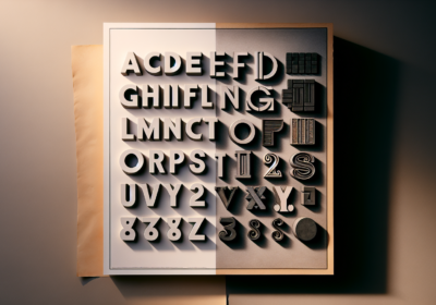
Even Beige, the debut release from About Type — Krista Radoeva’s newly launched foundry — plays ironically with neo-grotesque heritage. A font called Beige that offers “a thoughtful third way” between personality-free workhorses and expressive display fonts. Ten weights plus a monospace variant, four years in the making.
Why This Moment in Type Design MattersIt would be easy to frame all this historical excavation as nostalgia, but that misses what’s actually happening. Designers aren’t retreating from the present — they’re using the past to comment on it. BF Popaganda’s agitprop aesthetics land differently in 2026. ALT Erogenous’s feminist source text carries weight that a neutral grotesque revival simply wouldn’t.
After a long stretch of minimalism — the decade of clean sans-serifs and whitespace-as-philosophy — clients, art directors, and designers are hungry for type with friction. Fonts that feel like they came from somewhere, with a point of view baked into the letterforms themselves.
What Designers Should Take From March 2026’s ReleasesA few practical notes for working designers. BF Popaganda’s 16-style range gives it more versatility than its confrontational character suggests — there are weights that work for body copy in the right editorial contexts.
Please rewards designers willing to push its variable axes hard. Its strange heavy end is the selling point; don’t sand it down by keeping it in the safe middle of the weight slider.
And if you need something both historically rooted and formally aggressive — brand identity for cultural institutions, editorial work, packaging with a strong stance — Musikal and ALT Erogenous are underexplored options that will still feel current a decade from now.
The Bigger PictureMarch 2026’s releases read like a collective refusal to be neutral. When Neville Brody builds propaganda aesthetics into a commercial typeface, when a feminist text from 1972 becomes the basis for a new serif, when a designer spends three years coaxing a Victorian display face into something contemporary — these aren’t just font releases. They’re arguments about what type can do and why it still matters. That’s a good argument to be having.
Which of this month’s releases caught your eye? Are you seeing more designers choosing type with friction and history over clean, safe, and forgettable? Drop a comment — I’d love to know what’s landing on your desk.

I'm a programmer at heart. But in my 20s, I realized there was more to the world of fonts than just Courier.
Driven by endless curiosity, I built a system to explore them.
That project grew into one of the world’s leading font identifier platforms: www.WhatFontIs.com.
By 2024, WhatFontIs is helping nearly one million designers—famous or not—discover the names of the fonts they need.