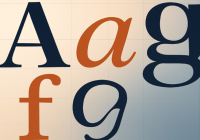

Twenty-five years ago, a typeface designed for a GQ cover quietly walked into a magazine office and never really left. Gotham went on to power Obama campaign posters, Coca-Cola packaging, Netflix interfaces, USPS signage, and roughly half the start-up decks made between 2008 and now. On May 12, 2026, Monotype marked the anniversary by releasing Gotham Variable, a full variable-font rebuild of the family. It is not a redesign. It is something more interesting: a quiet admission that the way we ship type has changed, and Gotham finally caught up.

Gotham Variable collapses what used to be a sprawling family of static fonts into a single file with continuous control over weight and width. That sentence sounds dry, but the practical effect is huge. Where a designer once juggled separate files for Light, Book, Medium, Bold, Black, plus their Condensed and Extra Narrow cousins, there is now one font and two sliders. You can pick a weight of 437 if you want to. You can land between Narrow and Compact. The family includes 120 variable styles across five widths and twelve weights, romans and italics, all packed into something a browser can load in a single request.
Monotype also used the rebuild as an excuse to fill in gaps. Fifty-four new intermediate static styles came out of the process, including a brand-new Compact width that sits between the original and the Narrow. Language support expanded too, with Vietnamese added — a notoriously tricky script because it stacks diacritics in ways that punish line-height assumptions. Cyrillic and Bulgarian got upgrades. Vietnamese was, in Monotype’s words, “one of the final major Latin language frontiers” for Gotham. That’s a real claim, and the team is right to be proud of it.
Why Now, Not Five Years AgoSara Soskolne, the executive creative director at Monotype who led the project, gave the most honest answer in her interview with Creative Bloq. Variable fonts hit the OpenType spec back in 2016. For years, designers treated them as a clever party trick. Soskolne said the team deliberately waited until variable fonts felt like “a workhorse” rather than “an experiment, an add-on, or a nice-to-have.” Reverse-engineering variability into a family that was never designed for it is brutal work. You only do it when the payoff is real.
And the payoff is real now. Browser support is universal. Tools like Figma and Adobe XD treat axes as first-class citizens. Performance budgets on mobile have squeezed every kilobyte of font weight until you can hear it complain. Shipping one variable file instead of six static ones is no longer a nice optimization — it is the default expectation from any team that cares about Core Web Vitals.
The Hard Part Was Hiding the MagicHere’s the thing about Gotham that people who don’t draw type might not realize: it was never one mathematically clean system. The original Hoefler & Frere-Jones design used different optical tricks at different weights and widths. Letters got subtly narrower, joins got slightly heavier, terminals shifted. That sleight of hand is what made Gotham feel right at any size. Static fonts let you hide those tricks at the boundaries. Variable fonts do not.
Soskolne put it bluntly: “All the spaces in between Gotham’s static styles — which were where we hid the sleight of hand involved in making them look the way they do — are now visible and completely accessible to users. So we had to be very intentional and critical about how that was handled.” Watch the variable width slider sweep from Extra Narrow to Condensed and you can see stroke endings physically reorient themselves to keep the rhythm tight. That is not a fade-between. That is a custom-tuned interpolation path that took months.
Backwards Compatible, On PurposeA detail that easily gets missed: Gotham Variable is fully backwards compatible with the existing Gotham family. Monotype could have used the anniversary as a chance to ship “Gotham 2.0,” fix a few old grievances, modernize some shapes. They did not. Soskolne called it “absolutely the right call,” and she is correct. There are thousands of brand systems running on Gotham right now where a quiet redrawing of the lowercase a would trigger a multimillion-dollar reset. The team added everything as expansion, changed nothing that already existed. That kind of discipline is rare.
If you are a brand team currently shipping Gotham across your design system, you can swap in the variable file tomorrow and nothing breaks. Your existing weights still match pixel-for-pixel. You just gain everything in between.
Who Should CareThree groups, mostly. Web developers get a single asset that replaces a stack of static files and unlocks fluid typography techniques — interpolating weight with viewport size, using grade axis tricks for dark mode, all the stuff that was theoretically possible with Inter or Roboto Flex but politically impossible with Gotham. Brand teams using Gotham gain expressive range without having to negotiate new licenses for additional cuts. Designers working in Vietnamese, Bulgarian, or Cyrillic-script languages finally get a Gotham that takes their writing systems seriously, with the same care Latin always enjoyed.
The one group that probably doesn’t need to rush is anyone happy with the static Gotham they already license. Nothing is broken. The variable file is an upgrade path, not a deprecation notice.
The Bigger SignalStep back from the product details and a pattern emerges. Google released Google Sans Flex with six variable axes. Inter shipped its variable cut years ago and currently sits at 414 billion Google Fonts requests per year. Now Gotham — the typeface that arguably defined American institutional design for a quarter century — has gone variable. The static font is not dead, but it is no longer the default. Modern type families are shipped as adaptable systems, and the foundries that drag their feet are going to look quaint very quickly.
What strikes me about Gotham Variable is how careful the work feels. Monotype could have shouted about the anniversary. Instead they shipped a deeply technical update that respects the original design, fixes real problems, and quietly pushes the entire industry forward. That is what mature typography looks like.
If you had to pick one variable font release that matters this year, this is probably it. Have you tried Gotham Variable yet, or is your team sticking with the static cuts? I’m curious which of the new intermediate widths people are actually reaching for.

I'm a programmer at heart. But in my 20s, I realized there was more to the world of fonts than just Courier.
Driven by endless curiosity, I built a system to explore them.
That project grew into one of the world’s leading font identifier platforms: www.WhatFontIs.com.
By 2024, WhatFontIs is helping nearly one million designers—famous or not—discover the names of the fonts they need.