Preview Garrick Condensed Bold font with your text


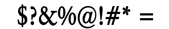
Garrick Condensed Bold font
Publisher
from Broderbund (included in ClickArt Fonts v5-2009)
License
$ Commercial
Date added
Jan 18 2017
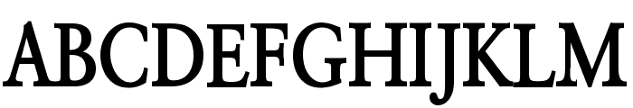
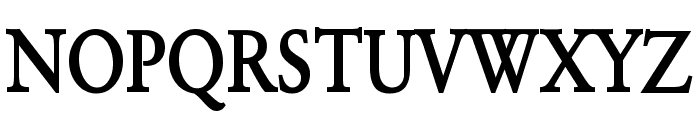
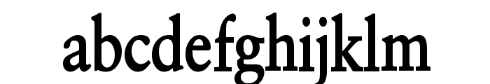
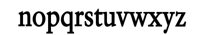
A bold, condensed serif font with high contrast.
This font features a classic serif style with condensed proportions and bold weight. The characters have a strong presence with high contrast between thick and thin strokes, giving it a traditional yet impactful appearance.
Ideal for headlines, book covers, and editorial design where a strong, classic look is desired.
Headlines, Editorial design
Balanced
Download Garrick Condensed Bold font. Garrick Condensed Bold by Copyright 1994 Bay Animation Inc. All Rights Reserved.
Ideal for headlines, book covers, and editorial design where a strong, classic look is desired.
Headlines, Editorial design
Balanced
WhatFontIs.com
whatfontis.com
Discover · Preview · Download
Find any Font
AI-powered · 1,200,000+ fonts
Find any Font
from any image
commercial or free
AI-powered · 1,200,000+ fonts
Commercial
from Broderbund (included in ClickArt Fonts v5-2009)
Now featuring
Garrick Condensed Bold
Uppercase Characters
Lowercase Characters
Numbers & Special Characters
Ideal for
Best use for
Best use for
this font
Headlines, Branding, Logos
Print, Digital, Advertising
whatfontis.com
Identify any font from an image
Upload · Identify
Visit WhatFontIs.com — the #1 Font Finder
Upload · Identify
Download Free
Visit WhatFontIs.com — the #1 Font Finder
Category
Bold
Yes
Italic
No
Weight
Bold
Width
Condensed
Character spacing
Tight
Line height
Normal
Contrast
High
Overall style
Classic
X height
Medium
Cap height
High
Help your fellow font-seekers if you think you can recognize the font. Earn some good karma by doing it :-) Answer & Help

Yet sometimes the images are very complex, so other users need a bit of help.
If you recognize the font from the samples posted here don't be shy and help a fellow designer.
Thousands of designers (famous or not) use the image font detection system to find a font or similar free fonts from an image. Although we have the largest database of fonts, the search for a font from an image gets mixed results like the image above.
Recognize the font? Browse forumHave a font you want to use on the web?
Webfont Generatorin seconds.