Preview DIN 1451 fette Breitschrift 1936 font with your text


DIN 1451 fette Breitschrift 1936 font
Publisher
License
$ Free for personal use
Date added
Jan 08 2017
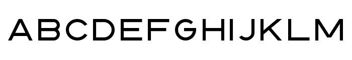
A bold, geometric sans-serif font with a modern industrial style.
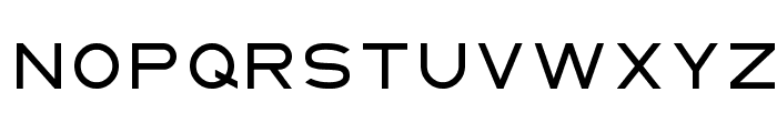
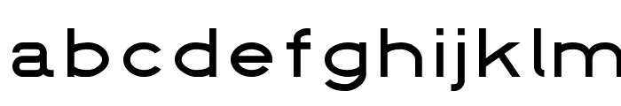
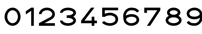
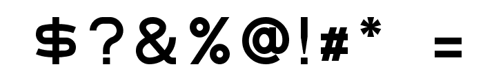
This font features a clean and geometric design with uniform stroke widths, creating a modern and industrial appearance. The characters are wide and bold, with a strong presence and minimal decorative elements.
Ideal for signage, branding, and headlines where clarity and impact are essential.
Headlines, Signage, Branding
Balanced
Download DIN 1451 fette Breitschrift 1936 font. DIN 1451 fette Breitschrift 1936 by
Ideal for signage, branding, and headlines where clarity and impact are essential.
Headlines, Signage, Branding
Balanced
(Fonts by www.peter-wiegel.de. Personal-use only. For commercial use please contact owner.)
WhatFontIs.com
whatfontis.com
Discover · Preview · Download
Find any Font
AI-powered · 1,200,000+ fonts
Find any Font
from any image
commercial or free
AI-powered · 1,200,000+ fonts
Free
Now featuring
DIN 1451 fette Breitschrift 1936
Uppercase Characters
Lowercase Characters
Numbers & Special Characters
Ideal for
Best use for
Best use for
this font
Headlines, Branding, Logos
Print, Digital, Advertising
Available on
⬇ Download Font
whatfontis.com
Identify any font from an image
Upload · Identify
Visit WhatFontIs.com — the #1 Font Finder
Upload · Identify
Download Free
Visit WhatFontIs.com — the #1 Font Finder
Category
Bold
Yes
Italic
No
Weight
Bold
Width
Expanded
Character spacing
Normal
Line height
Normal
Contrast
Low
Overall style
Modern
X height
Medium
Cap height
High
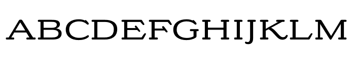
Similar Free Fonts for DIN 1451 fette Breitschrift 1936
$ Free > Personal Use
$ Free > Personal Use
Similar fonts for DIN 1451 fette Breitschrift 1936 from Adobe.com
$ Commercial > Adobe.com
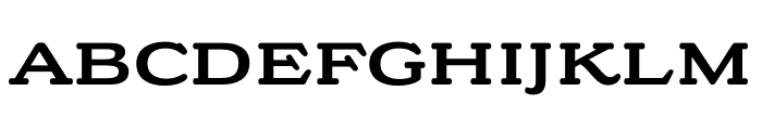
$ Commercial > Adobe.com
Similar fonts for DIN 1451 fette Breitschrift 1936 from MyFonts.com

$ Commercial > MyFonts.com

$ Commercial > MyFonts.com
Similar fonts for DIN 1451 fette Breitschrift 1936 from CreativeMarket.com

$ Commercial > CreativeMarket.com

$ Commercial > CreativeMarket.com

Help your fellow font-seekers if you think you can recognize the font. Earn some good karma by doing it :-) Answer & Help

Yet sometimes the images are very complex, so other users need a bit of help.
If you recognize the font from the samples posted here don't be shy and help a fellow designer.
Thousands of designers (famous or not) use the image font detection system to find a font or similar free fonts from an image. Although we have the largest database of fonts, the search for a font from an image gets mixed results like the image above.
Recognize the font? Browse forumHave a font you want to use on the web?
Webfont Generatorin seconds.