Preview HIGH CONSEQUENCES-Inverse font with your text


HIGH CONSEQUENCES-Inverse font
Publisher
Creative Fabrica
License
$ Commercial
Date added
Feb 14 2024
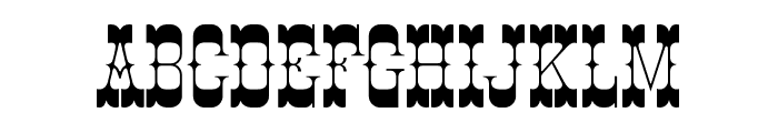
Bold, angular, and geometric with high contrast.
This font features bold, angular characters with a distinct geometric style. The letters are tightly spaced with high contrast between thick and thin strokes, giving it a striking and modern appearance.
Ideal for posters, headlines, and branding projects that require a bold statement.
Headlines, Logos
Balanced
Download HIGH CONSEQUENCES-Inverse font. HIGH CONSEQUENCES-Inverse by weknow ? (weknow.deviantart.com). 2013. All Rights Reserved
Ideal for posters, headlines, and branding projects that require a bold statement.
Headlines, Logos
Balanced
WhatFontIs.com
whatfontis.com
Discover · Preview · Download
Find any Font
AI-powered · 1,200,000+ fonts
Find any Font
from any image
commercial or free
AI-powered · 1,200,000+ fonts
Commercial
Creative Fabrica
Now featuring
HIGH CONSEQUENCES-Inverse
Uppercase Characters
Lowercase Characters
Numbers & Special Characters
Ideal for
Best use for
Best use for
this font
Headlines, Branding, Logos
Print, Digital, Advertising
whatfontis.com
Identify any font from an image
Upload · Identify
Visit WhatFontIs.com — the #1 Font Finder
Upload · Identify
Download Free
Visit WhatFontIs.com — the #1 Font Finder
Category
Bold
Yes
Italic
No
Weight
Bold
Width
Normal
Character spacing
Tight
Line height
Short
Contrast
High
Overall style
Modern
X height
Medium
Cap height
High

$ Free > Personal Use

$ Free > Personal Use
Similar fonts for HIGH CONSEQUENCES-Inverse from Adobe.com

$ Commercial > Adobe.com
$ Commercial > Adobe.com
Similar fonts for HIGH CONSEQUENCES-Inverse from MyFonts.com

$ Commercial > MyFonts.com

$ Commercial > MyFonts.com
Similar fonts for HIGH CONSEQUENCES-Inverse from CreativeMarket.com

$ Commercial > CreativeMarket.com
$ Commercial > CreativeMarket.com

Help your fellow font-seekers if you think you can recognize the font. Earn some good karma by doing it :-) Answer & Help
Yet sometimes the images are very complex, so other users need a bit of help.
If you recognize the font from the samples posted here don't be shy and help a fellow designer.
Thousands of designers (famous or not) use the image font detection system to find a font or similar free fonts from an image. Although we have the largest database of fonts, the search for a font from an image gets mixed results like the image above.
Recognize the font? Browse forumHave a font you want to use on the web?
Webfont Generatorin seconds.